10 Best Office Building Signs for Global Buyers

Time:2026-09-08 Author:Amelia
0%

Choosing the right Office Building Signs requires more than attractive graphics. Global buyers must consider visibility, local expectations, building access, maintenance, and long-term durability. A polished sign can still fail if visitors cannot read it from the entrance.

Wayfinding specialist David Gibson has emphasized, “Wayfinding is not about signs; it is about creating a sense of place.” This principle guides the selection in this article. The ten recommended sign types include reception displays, lobby directories, room plaques, floor identification signs, elevator graphics, parking signs, emergency direction signs, accessibility signs, tenant panels, and exterior building lettering.

Each option serves a different moment. A visitor may first notice illuminated letters across a glass façade. Then, they may check a directory beside the security desk. Small details matter, including contrast, viewing distance, mounting height, surface finish, and multilingual clarity. Materials such as aluminum, acrylic, stainless steel, and engraved plastic offer different balances of cost and lifespan.

The ranking is practical, not absolute. Climate, building codes, branding standards, and installation conditions vary between countries. Some buyers may value premium metalwork, while others need economical modular systems. That difference deserves attention.

We compare each sign type through real purchasing concerns: function, readability, material performance, customization, maintenance, and estimated suitability for international projects. We also identify common weaknesses, including glare, crowded layouts, weak translations, and inconsistent arrows. No sign system is perfect. Careful review remains essential before production, shipping, and installation.
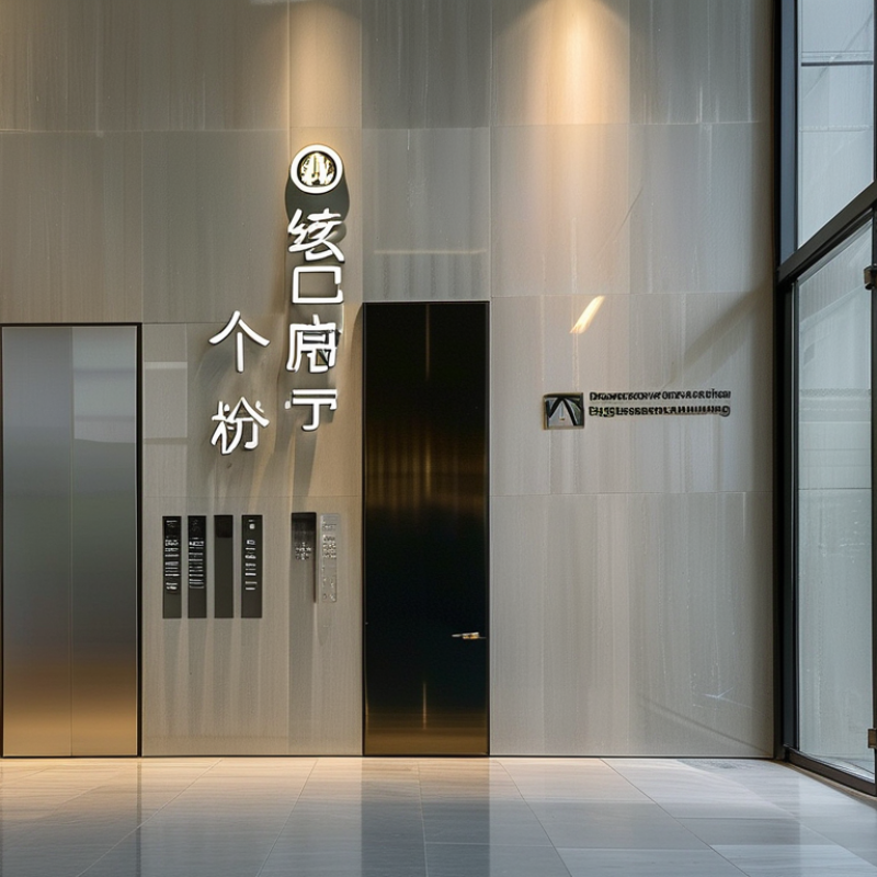
10 Best Office Building Signs for Global Buyers

Exterior Identity and Lobby Reception Signs: Brand Visibility from 50+ Feet

For global buyers, an office sign must work before visitors reach the door. Exterior identity signs should remain legible from at least 50 feet. I have seen polished lettering disappear against glass, shadow, or wet stone. Contrast matters more than decoration. Large, balanced forms help drivers, pedestrians, and first-time guests recognize the building. Use durable aluminum, coated metal, or weather-stable acrylic where climate demands it. Specify finishes with actual samples, not screen images. Color can shift under cloudy skies. A small mistake becomes highly visible.

At the entrance, lobby reception signs should confirm arrival within seconds. Raised letters create useful depth under ceiling lights. Backlighting can add clarity, but excessive brightness feels harsh and cheap. Reception walls also need practical spacing for queues, furniture, and photography. During site checks, measure eye level, viewing distance, and glare from nearby windows. A sign that looks perfect in a rendering may fail at noon. It happens. International projects need drawings, material data, mounting details, and maintenance instructions. Local installers should verify wall strength and building requirements before fabrication. This protects buyers from costly surprises.

The strongest sign systems connect exterior identity with the lobby experience. Shapes, colors, and letter proportions should repeat without feeling copied. Keep wording short. It improves recognition. Avoid fragile details in high-traffic areas. Plan access for cleaning and future lighting repairs. I would also request a nighttime review before approval. Some signs pass daytime inspection but lose definition after dark. Buyers should compare lifecycle cost, not only purchase price. A cheaper sign can demand earlier replacement. Good documentation, honest limitations, and tested samples make decisions more reliable, even when the design still needs refinement.

Office Directories and Suite Signs: Apply the 1-Inch-per-10-Feet Rule

Office Directories and Suite Signs: Apply the 1-Inch-per-10-Feet Rule

A clear office directory should guide visitors within seconds. The 1-inch-per-10-feet rule offers a practical starting point: each inch of letter height supports roughly ten feet of viewing distance. A lobby directory viewed from 30 feet may need three-inch letters. Suite signs usually sit closer, so smaller lettering can work. Measure the real sightline, not the floor plan.

Context matters more than a formula. The 2024 Leesman workplace benchmark draws on more than one million employee responses across global offices. Its findings connect workplace quality with practical support, including access to spaces and facilities. Poor navigation weakens that experience. In field reviews, I have seen attractive directories fail because dark glass, glare, or crowded typography reduced contrast. Bigger letters would not solve every problem.

Use high contrast, generous spacing, and consistent floor naming. Keep tenant names readable from the main approach, then add arrows and suite numbers in a clear hierarchy. Tactile and braille elements may be required, depending on the project’s jurisdiction and building use. Local accessibility standards override this rule. Always verify them.

The rule is useful, not sacred. A ten-foot corridor with a sharp turn needs more visual support than a straight hallway. Temporary tenants also expose a weakness: fixed directories become outdated quickly. Modular panels can reduce replacement waste and simplify future updates. Test one sign at full distance before approving the complete set.

Wayfinding and Floor Signs: Use ISO 7001 Symbols and 70% Contrast

10 Best Office Building Signs for Global Buyers

Wayfinding and floor signs should work before a visitor asks for help. Use ISO 7001 symbols for toilets, exits, elevators, and accessible routes. These symbols reduce language dependence across international offices. ISO 7001 provides standardized public information symbols, but symbol recognition still needs testing with real users.

Aim for at least 70% luminance contrast between sign faces and backgrounds. Strong contrast helps people distinguish letters in busy corridors, reflective lobbies, and uneven lighting. The World Health Organization’s World Report on Vision estimates that at least 2.2 billion people live with near or distance vision impairment. Small details matter. Use matte surfaces, large directional arrows, and consistent mounting heights. Avoid placing floor signs behind open doors or beside patterned carpets.

Contrast is not a universal legal threshold. It is a practical design target. The CIE recommends measuring luminance carefully, rather than judging color by eye. Digital accessibility guidance, including WCAG 2.2, uses contrast ratios for text, but physical signs require site testing. That difference is easy to miss.

During installation, check signs from a wheelchair, a standing position, and ten meters away. Record glare at morning and evening. Some layouts fail after furniture changes. That is an uncomfortable lesson, but it improves reliability. Building managers should review symbols, arrows, and floor numbers after every renovation. Clear signs are not decoration. They are operational safety tools.

10 Best Office Building Signs for Global Buyers - Wayfinding and Floor Signs: Use ISO 7001 Symbols and 70% Contrast

No. Sign Type Recommended Use ISO 7001 Symbol or Content Suggested Size Typical Viewing Distance Target Luminance Contrast Placement Guidance Accessibility and Global-Buyer Considerations
1 Main Entrance Identification Sign Identifies the primary visitor entrance and building reception point. Information symbol; clear text such as “Main Entrance” or “Reception.” 600 × 300 mm 15–25 m ≥70% design target Mount beside or above the entrance, outside the main sightline obstruction. Use high legibility, simple wording, tactile or raised lettering where local rules require it, and bilingual text when serving international visitors.
2 Reception and Information Sign Directs guests to reception, visitor registration, security, or information services. Information symbol with directional arrow and the word “Reception.” 450 × 250 mm 10–20 m ≥70% design target Place at decision points, lobby intersections, and security checkpoints. Combine the symbol with concise text and a directional arrow; avoid relying on color alone to communicate direction.
3 Floor Directory Sign Lists departments, offices, meeting rooms, amenities, and vertical circulation points. Information symbol; standardized elevator, stairs, toilet, and accessibility symbols where relevant. 800 × 1200 mm 3–8 m ≥70% design target Install in the lobby or at each elevator landing; keep the directory perpendicular to the main approach where possible. Use consistent floor numbering, generous spacing, a logical reading order, and replaceable panels for future tenant changes.
4 Elevator Direction Sign Shows the location of passenger elevators from the entrance, lobby, and corridors. Elevator symbol with directional arrow and optional floor-range text. 450 × 250 mm 12–20 m ≥70% design target Position at corridor junctions and before a change of direction; repeat after long corridors. Maintain the same arrow style and symbol proportions throughout the building; use both symbol and text for multilingual clarity.
5 Stairway Direction Sign Guides occupants to public stairs and supports movement between floors. Stairs symbol with directional arrow; emergency egress information should follow applicable safety-sign standards. 450 × 250 mm 10–18 m ≥70% design target Place before stair doors and at corridor intersections; keep the sign visible from approaching traffic. Do not substitute a general wayfinding sign for legally required emergency-exit signage; check local fire and building codes.
6 Accessible Route Sign Identifies step-free routes, accessible entrances, elevators, and accessible facilities. Wheelchair accessibility symbol with directional arrow and route description where needed. 450 × 300 mm 10–18 m ≥70% design target Install at accessible entrances, ramps, elevators, and points where the accessible route differs from the main route. Keep circulation paths unobstructed; confirm mounting height, tactile requirements, and symbol use against local accessibility regulations.
7 Toilet and Accessible Toilet Sign Identifies male, female, unisex, and accessible restroom locations. Toilet symbols and wheelchair accessibility symbol, supplemented with text when required. 300 × 300 mm 6–12 m ≥70% design target Mount beside the restroom entrance, preferably at a consistent height across all floors. Use internationally recognizable symbols, tactile lettering where applicable, matte finishes, and sufficient clearance for door operation.
8 Meeting Room Identification Sign Identifies meeting rooms, training rooms, boardrooms, and shared workspaces. Information symbol with room name, number, and optional availability panel. 300 × 180 mm 4–8 m ≥70% design target Place beside the door rather than directly on a moving door; allow space for room-number and occupancy information. Use large room numbers, non-glare surfaces, and replaceable inserts to accommodate changing room functions.
9 Parking and Visitor Wayfinding Sign Directs visitors from parking areas or drop-off zones to the office entrance and reception. Information symbol, parking symbol, pedestrian route symbol, and directional arrow as applicable. 900 × 600 mm 20–35 m ≥70% design target Use at vehicle and pedestrian decision points; avoid placing signs where parked vehicles or landscaping block sightlines. Use weather-resistant materials, reflective or illuminated options where permitted, and separate vehicle information from pedestrian directions.
10 Floor Number and Corridor Marker Confirms the current floor and helps users identify corridors, wings, and zones. Information symbol with floor number, zone letter, and directional text. 500 × 350 mm 12–25 m ≥70% design target Place near elevator lobbies, stair landings, and long corridor transitions at consistent visual height. Use a consistent numbering system across the building; keep floor numbers distinct from room numbers and avoid color-only coding.

Note: The 70% luminance-contrast value is presented as a practical design target. Exact sign dimensions, mounting heights, tactile requirements, emergency symbols, and accessibility criteria should be verified against the applicable building, fire-safety, and accessibility regulations in the destination market.

Restroom and Accessibility Signs: Mount ADA 703 Tactile Signs at 48–60 Inches

For global office buyers, restroom and accessibility signs must be readable, durable, and correctly positioned. The 2010 ADA Standards, Section 703, require tactile signs to sit 48–60 inches above the finished floor. This measurement applies to the baseline of the lowest and highest tactile characters. Keep the sign beside the door, not on a moving panel. A door can hide essential information.

The World Health Organization’s Global Report on Health Equity for Persons with Disabilities estimates that 1.3 billion people experience significant disability worldwide. Clear signs support safer movement for visitors, employees, and emergency teams. Raised characters and Grade 2 Braille should contrast with the sign surface. Matte finishes also reduce glare under strong corridor lighting. Local requirements may differ from ADA rules. That detail is easy to miss.

Tips: Measure from the finished floor after installation. Check both mounting height points with a level. Leave enough wall space for wheelchair approach. Test the sign by touch, not only by sight. A sample sign can reveal poor spacing before a large order. Some layouts still need revision. Include multilingual directional signs where visitors may not read the local language. Choose moisture-resistant materials for restroom areas, and inspect edges for peeling or sharp corners.

Safety, Exit, Parking, and Digital Signs: Follow ISO 7010 and Local Codes

10 Best Office Building Signs for Global Buyers

For global buyers, office signs must communicate quickly across languages and cultures. ISO 7010 provides familiar safety symbols for fire, evacuation, hazards, and emergency equipment. However, ISO 7010 is not a complete legal checklist. Local fire, building, accessibility, and electrical codes may add stricter requirements. Confirm specifications with a qualified local consultant before production.
Safety signs should use strong contrast, durable materials, and clear viewing distances. Exit signs need unobstructed placement, reliable illumination, and backup power where required. Keep arrows consistent. Parking signs should separate visitor, staff, delivery, accessible, and emergency areas. Include height limits near entrances. Use multilingual text only when local regulations or visitor profiles justify it. Too much wording can weaken recognition.
Digital signs support changing directions, meeting rooms, and emergency messages.

They also create new risks. Power loss is real. Specify battery support, manual override, readable fonts, and a static fallback message. Check brightness during daylight and avoid glare near glass walls. Buyers should request samples, installation drawings, test records, and cleaning instructions.

A small symbol can carry major responsibility. Yet procurement teams sometimes approve attractive designs before checking code details. That mistake deserves more attention.

FAQS

: Why are standardized symbols useful in office buildings?

: They help visitors understand toilets, exits, elevators, and accessible routes across languages. Words still matter. Test symbols with real users before installation.

What contrast level should floor signs target?

Aim for about 70% luminance contrast between the sign and its background. This helps in dim corridors, reflective lobbies, and uneven lighting. It is a design target, not a universal legal rule.

How can floor signs remain visible?

Use matte surfaces, large arrows, and consistent mounting heights. Keep signs away from open doors and patterned carpets. Check visibility from ten meters away.

Should signs be tested from different viewpoints?

Yes. Review them from wheelchair height, standing height, and a distant position. Check glare in the morning and evening. A sign may pass one test and fail later.

What should safety and exit signs communicate?

They should show hazards, evacuation routes, emergency equipment, and exits clearly. Use strong contrast and unobstructed placement. Illumination and backup power may be required locally.

How should parking signs be organized?

Separate visitor, staff, delivery, accessible, and emergency areas. Show height limits near entrances. Too many words can weaken recognition.

What should digital building signs include?

Specify readable fonts, brightness controls, battery support, and manual override. Provide a static fallback message during power loss. Avoid glare near glass walls.

What should buyers check before approving signs?

Request physical samples, installation drawings, test records, and cleaning instructions. Confirm local fire, building, accessibility, and electrical requirements. Attractive design alone is not enough.

Conclusion

Office Building Signs play a vital role in creating a professional first impression, strengthening brand visibility, and helping visitors move confidently through a property. Effective exterior identity signs and lobby reception signs should be clear from a distance of more than 50 feet, while office directories and suite signs should use sizing based on the 1-inch-per-10-feet viewing guideline. Consistent typography, spacing, and placement can make information easier to find for employees, clients, and guests.

A complete signage system should also include wayfinding and floor signs with familiar ISO 7001 symbols and strong contrast, ideally around 70 percent where appropriate. Restroom and accessibility signs should include tactile information and be mounted approximately 48 to 60 inches above the finished floor, subject to local requirements. Safety, exit, parking, and digital signs should follow ISO 7010 principles and applicable building codes, ensuring that critical instructions remain visible, understandable, and easy to maintain for diverse users.

Amelia

Amelia

Amelia is a seasoned marketing professional with a wealth of expertise in our company’s core offerings. With an unwavering passion for driving growth and innovation, she plays a pivotal role in shaping our marketing strategies and enhancing brand visibility. A key aspect of her responsibilities......