Choosing the best Business Wall Sign is more than selecting attractive lettering. It is a practical decision involving visibility, brand identity, materials, lighting, and installation conditions. A sign should help visitors recognize your business quickly, whether they approach a glass storefront, a brick reception wall, or a busy indoor hallway.
Start with the building itself. Measure the available wall space, observe daylight changes, and check how customers naturally enter the area. Experienced sign designers also consider viewing distance, contrast, mounting height, and cleaning requirements. A matte acrylic sign may suit a modern office, while dimensional metal letters can create a stronger presence in a hotel lobby. Material quality matters. Poor finishes can fade, warp, or collect dust sooner than expected.
Keep the message clear.
Reliable recommendations should come from material specifications, installation experience, and verified supplier information. Ask about durability, maintenance, warranty coverage, and whether the proposed design meets local building or property requirements. These details are easy to overlook when a polished digital mockup looks convincing. I have seen attractive signs lose impact because their letters were too small or their colors blended into the wall. That is a useful warning: visual appeal alone cannot guarantee performance. The right Business Wall Sign balances readability, safety, budget, and long-term brand consistency. It should look appropriate today, but remain useful as your business grows and customer expectations change.
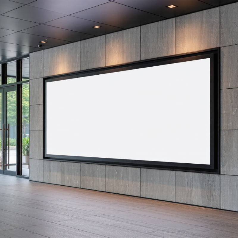
How to Choose the Best Business Wall Sign?
Define Your Business Wall Sign’s Purpose and Audience
A wall sign should answer one practical question: what must people understand here? Your purpose may be identification, wayfinding, promotion, or reassurance. These goals need different layouts, materials, and viewing distances. Purpose comes first.
The Sign Research Foundation’s review of on-premise signage found that 60% of surveyed businesses reported sales increases after improving their signs. That finding supports investment, but it does not guarantee results. A beautiful sign cannot rescue unclear messaging. Decide whether customers need your name, service, location, or a direct action. Then remove everything else.
Your audience shapes every visual choice. A clinic may need calm colors, high contrast, and readable lettering for older visitors. A busy workshop may need bold type visible from a parking area. The International Sign Association emphasizes visibility, legibility, and placement as core sign-performance factors. Keep it legible.
Stand outside your building and measure the viewing distance. Check the sign at noon, dusk, and during rain. A short audience test can reveal problems that a design screen hides. Ask five people what they noticed first. Their answers may be uncomfortable, but useful.
Avoid choosing materials only because they look impressive. Reflective finishes can create glare, while thin lettering may disappear against textured walls. I would also question oversized signs in small spaces; they can make visitors feel pressured. The best business wall sign serves the audience before it decorates the building.
Visibility and perceived quality are the strongest reasons to invest in a business wall sign. Choose a design that is easy to notice, supports a professional image, and clearly communicates what your business offers to its intended audience.
Data shown as the percentage of consumers reporting each signage-related effect in a national consumer signage survey.
Choosing a business wall sign starts with the building, not the logo. A sign facing strong sun needs UV-resistant acrylic, aluminum, or coated composite panels. For sheltered interiors, painted wood or high-density urethane can provide warmer texture. Moisture, salt air, cleaning chemicals, and temperature changes should guide the material choice.
The Sign Research Foundation and the University of Cincinnati reported that 60% of surveyed businesses saw sales increases after improving on-premise signage. The average reported increase was about 10%. That figure supports visibility, but it does not excuse poor construction. A thin panel may look affordable until edges warp, colors fade, or fasteners loosen. Test the finish near a window. Check it after rain.
Style also affects perceived quality. Raised lettering creates shadows and depth, while flat printed panels offer easier updates. Illuminated signs improve nighttime readability, but they require careful glare control and reliable electrical components. Industry guidance from the International Sign Association emphasizes proper installation, structural support, and regular inspection. These details are often ignored. That is a mistake. I would compare samples at actual viewing distance, not on a small desk. The darkest color may lose clarity at dusk, and a beautiful texture may collect dust around every letter. Durability is not only material strength; it is maintenance time, repair access, and how consistently the sign communicates over several years.
A business wall sign must fit its surroundings, not simply fill empty space. In field surveys, I measure the wall, viewing distance, and pedestrian approach before suggesting dimensions. A sign that looks impressive indoors may disappear across a wide parking area. A practical rule is to test lettering from the farthest realistic viewing point. Keep the wording brief. Every extra word reduces reading speed.
Location shapes attention. Place the sign where customers naturally pause, such as near an entrance or reception desk. Avoid corners hidden by doors, trees, parked vehicles, or seasonal displays. Eye-level placement often works for pedestrians, while elevated signs may suit drivers. Check shadows and afternoon glare. Lighting changes everything. A small, high-contrast sign can outperform a larger sign with thin lettering.
Visibility depends on contrast, type size, spacing, and background texture. Use strong contrast without creating harsh visual noise. Leave clear space around the sign so nearby windows do not compete. I once approved a sign that was technically readable, yet felt too small after installation. That was my mistake. A temporary paper mockup would have exposed it. Review the sign at different distances and times of day. Local installation requirements should also be checked before fabrication.
A business wall sign should express your identity before customers enter. From reviewing storefronts, I have seen simple signs attract more attention than crowded designs. Choose colors, shapes, and materials that reflect your business personality. A warm wood finish may suggest comfort, while clean metal can communicate precision. Branding should feel consistent with your interior, website, and printed materials.
Readability depends on distance, lighting, and viewing time. Test the sign from across the street, not only from your desk. Use clear lettering, strong contrast, and enough spacing between words. Avoid thin fonts and glossy surfaces that create glare. A useful rule is to remove one design element, then check whether the message becomes clearer. I often find this step uncomfortable, but it improves decisions.
Tips: Check contrast in daylight and at night. Keep essential text brief. Use accessible letter sizing and uncluttered layouts. Avoid relying on color alone; symbols and readable text should carry meaning too. Consider wheelchair users, older visitors, and people with limited vision. Tactile lettering or Braille may be appropriate, depending on the sign’s purpose and local accessibility requirements. Ask an experienced sign professional to review mounting height, lighting, and installation safety. A second opinion can reveal problems you missed.
| Sign Type | Branding Impact | Typical Readability Distance | Visibility and Contrast | Accessibility Considerations | Typical Service Life | Best Use |
|---|---|---|---|---|---|---|
| Dimensional Letters | High Creates a refined, permanent appearance and supports consistent visual identity through letter depth, spacing, and finish. |
Approximately 50–100 ft when uppercase letters are about 6–12 inches high and placed in a clear viewing area. | Strong performance with matte finishes and high contrast between the letters and wall. Non-glare surfaces reduce reflections. | Use clear letter spacing, a simple typeface, and tactile or raised lettering where required by the location and applicable regulations. | 5–15 years, depending on material, coating, climate, and installation quality. | Permanent exterior façades, reception areas, and professional offices. |
| Internally Illuminated Cabinet | High Provides strong nighttime presence and makes the business name visible during extended operating hours. |
Approximately 100–300 ft, depending on letter height, lighting output, viewing angle, and surrounding light levels. | Uniform illumination and dark-on-light or light-on-dark contrast improve recognition. Avoid excessive brightness that can cause glare. | Keep illumination steady rather than flashing, use readable type, and maintain adequate contrast for people with low vision. | 7–12 years; LED components generally require less maintenance than fluorescent systems. | Retail storefronts, roadside locations, and businesses operating after dark. |
| External Halo-Lit Letters | High Produces a premium, understated effect through a glow behind the letters without visually overwhelming the façade. |
Approximately 50–150 ft, with performance influenced by wall color, letter size, and ambient lighting. | Works best on darker, non-reflective backgrounds. The glow should remain even and controlled to preserve letter definition. | Use sufficiently large lettering, strong foreground contrast, and non-flashing illumination. Lighting alone should not be relied on for essential information. | 5–12 years, depending on LED quality, weather sealing, and power supply maintenance. | Hotels, restaurants, offices, and high-end commercial entrances. |
| Flat Panel Sign | Medium to High Offers a broad design area for logos, messaging, color blocks, and directional information. |
Approximately 50–200 ft, depending on panel dimensions, text size, and viewing speed. | High-contrast colors and a low-glare laminate improve daytime reading. Complex backgrounds can reduce text visibility. | Use readable type, sufficient spacing, plain-language messaging, and a contrast ratio of at least 4.5:1 for normal-sized digital text where applicable. | 5–10 years, with printed graphics often requiring earlier replacement than the panel structure. | Building entrances, service counters, directories, and branded wall displays. |
| Vinyl Wall Graphics | Medium Supports flexible campaigns, interior branding, murals, and temporary promotional messaging. |
Approximately 20–100 ft, depending on text size, print quality, wall texture, and lighting. | Matte vinyl reduces reflections. Large text and simple color combinations are easier to read than detailed photographic designs. | Do not place essential directions only within decorative imagery. Provide adequate contrast and keep pathways, doors, and safety equipment unobstructed. | 2–7 years, varying considerably by indoor or outdoor use and surface preparation. | Interior branding, temporary promotions, event graphics, and low-cost visual updates. |
| Digital Display Wall | High Enables changing content, motion, announcements, and time-sensitive messages, but requires disciplined content control. |
Approximately 100–500 ft, depending on screen size, pixel pitch, brightness, and viewing distance. | Brightness should adapt to ambient conditions. Avoid rapid animation, small text, and low-contrast color combinations. | Provide high-contrast text, sufficient display time, captions for video, and a non-animated alternative for essential information. | 5–10 years, depending on operating hours, environmental conditions, and component replacement. | Large venues, lobbies, public information areas, and frequently changing announcements. |
Planning note: Readability distances are typical design ranges rather than guarantees. Final performance depends on letter height, viewing angle, illumination, contrast, installation height, environmental conditions, and local sign regulations.
Choosing a business wall sign starts with the installation site, not the artwork. Measure wall structure, wind exposure, access height, and nearby electrical routes. A heavy cabinet sign may require engineered anchors or a lift.
Small details matter.
Check local planning rules before ordering. Permit requirements can change by district, building type, illumination, and sign projection. Some properties also require landlord approval or historic-area review.
Accessibility rules may affect placement, contrast, and clearance, although exterior signs are not automatically covered in every situation. Ask the local authority for written requirements.
Rules are easy to misunderstand.
Total cost includes fabrication, permits, wiring, equipment rental, installation, maintenance, and removal. The Sign Research Foundation’s Economic Value of On-Premise Signs study reported that 49.7% of surveyed businesses saw sales increases after adding or improving signage. That supports investment, but it does not guarantee results.
Energy use also deserves attention. The U.S. Department of Energy reports that LED lighting uses at least 75% less energy than incandescent lighting and lasts much longer. Request a five-year cost estimate, including repairs and electricity.
Measure twice. Budgets drift.
A practical site survey may reveal that a simpler sign performs better.
Match the material to the building and local exposure. Strong sun needs UV-resistant acrylic, aluminum, or coated composite panels. Sheltered interiors may suit painted wood or high-density urethane. Moisture, salt air, chemicals, and temperature changes also matter.
They can improve reading after sunset. Use reliable electrical parts and control glare carefully. A bright sign is not always a clear sign. Check light spill near windows and neighboring spaces.
Test the wording from the farthest realistic viewing point. A sign can look large indoors but vanish across a parking area. Keep the message brief. Every extra word can slow reading.
Place it near natural stopping points, such as entrances or reception desks. Avoid doors, trees, vehicles, and seasonal displays. Eye-level placement often helps pedestrians. Higher placement may suit drivers. Location changes attention.
Use readable type, strong contrast, generous spacing, and a calm background. Leave clear space around the sign. Thin lettering may disappear at dusk. A smaller, high-contrast sign can outperform a larger weak design.
Measure wall strength, wind exposure, access height, and nearby electrical routes. Heavy signs may need engineered anchors or lifting equipment. Check structural support before fabrication. Small oversights become expensive.
Requirements vary by district, building type, lighting, and sign projection. Landlords or historic-area reviewers may also require approval. Ask the local authority for written requirements. Rules are easy to misunderstand.
Include fabrication, permits, wiring, equipment rental, installation, maintenance, and removal. Request a five-year estimate for electricity and repairs. Energy-efficient lighting may reduce long-term costs. Budgets drift. A simpler sign might perform better.
Choosing the best Business Wall Sign begins with a clear understanding of its purpose and audience. Decide whether the sign is meant to attract attention, guide visitors, reinforce your identity, or provide essential information. Then compare suitable materials, styles, and durability based on your environment, maintenance expectations, and desired appearance. A well-designed sign should match your space while remaining practical and long-lasting.
Size, placement, and visibility are equally important. Select a location where your audience can easily notice and read the sign, considering viewing distance, lighting, traffic flow, and surrounding elements. Use consistent branding, clear typography, strong contrast, and accessible wording to improve recognition and readability. Before making a final decision, review installation requirements, property rules, permits, safety considerations, and the total cost, including production, mounting, maintenance, and possible updates. A thoughtful balance of appearance, function, compliance, and value will help your wall sign communicate effectively and support your business for years.

Kexian