A visitor often notices the reception wall before meeting anyone on your team. A clear Business Logo Wall Sign gives that first glance a focal point and helps connect your name with the place where you work. It might be cut metal above a walnut desk, or layered acrylic catching soft light near the entrance. Small choices matter.
The right sign can make a space feel considered, not merely decorated. Scale, contrast, material, and lighting all affect legibility. A polished finish may suit a creative studio, while painted lettering can feel quieter in a small office. Measure the wall from common viewing distances, and check how daylight changes the colors. Details are easy to miss.
Still, a logo sign cannot create trust on its own. If visitors encounter confusing directions or a neglected space, the wall may feel like a promise the business has not kept. That is worth admitting. A practical choice starts with your actual setting, not just a product photo: note the wall surface, available power, cleaning needs, and installation constraints. Ask a qualified sign professional about mounting and material options when the wall or sign is unusual. With those basics considered, a Business Logo Wall Sign can support recognition while fitting naturally into the space. It should look like your brand belongs there. Sometimes, the simplest design does that best.
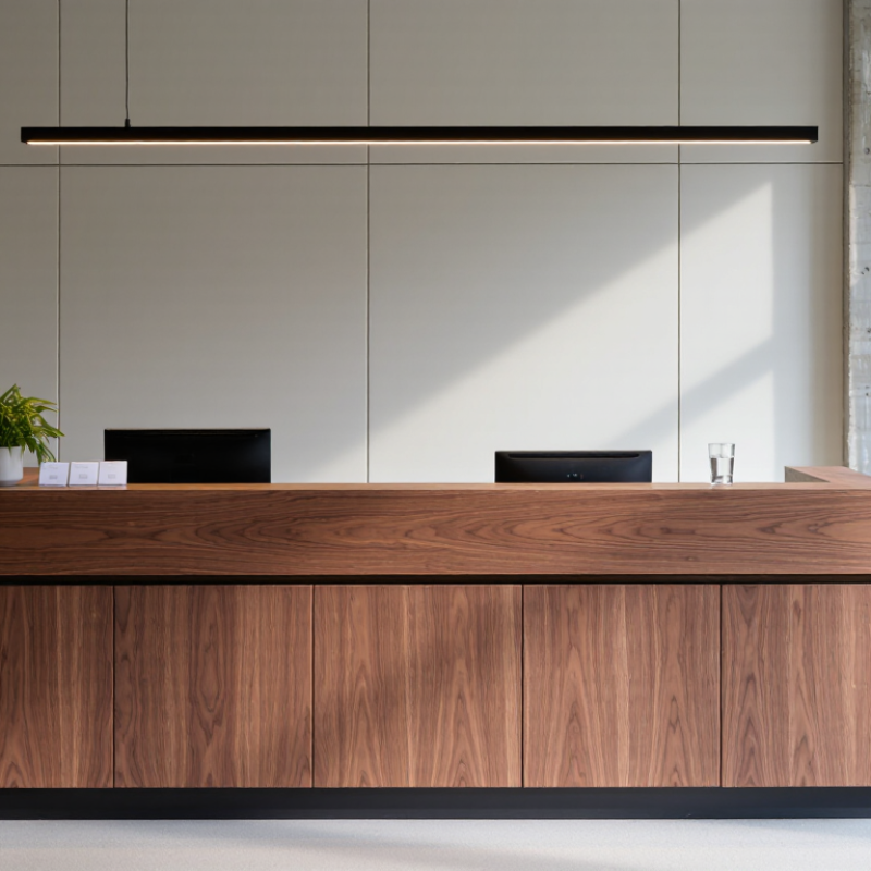
A business logo wall sign is a fixed display mounted on an interior or exterior wall, featuring a company’s name, symbol, or both. Common materials include acrylic, metal, dimensional lettering, and illuminated panels. Unlike a temporary poster, it is designed to stay in place and identify a location. In a reception area, raised metal letters can catch light; near an entrance, a clear logo helps visitors recognize the right door.
The sign also shapes a visitor’s first impression, but it cannot explain every service or replace helpful staff. A 2012 FedEx Office survey, commissioned through Ketchum, found that 76% of respondents had entered a store they had not visited before based solely on its signs. The survey also reported that 68% had bought a product or service because a sign caught their eye. These figures describe that survey, not every business today. Still, they show why visibility and legibility deserve attention.
Tip: Check the logo from the actual viewing distance. Keep strong contrast, allow space around the lettering, and confirm the wall can support the sign’s weight. Ask someone unfamiliar with the design to read it. If they hesitate, the sign may need simplifying. A small detail can be missed.
A business logo wall sign communicates identity before anyone reads a brochure or speaks with your team. Its shape, color, material, and placement tell visitors what kind of experience to expect. A brushed-metal mark behind reception can feel formal; painted lettering on a textured wall may feel more relaxed. Small details matter. The sign also gives staff and guests a shared visual reference, making the space feel intentional rather than anonymous.
Consistency strengthens that message. The 2019 State of Brand Consistency report estimated that consistent presentation can increase revenue by up to 23%. A wall sign helps carry familiar colors and visual cues into a physical setting, where visitors can see them at a glance. A 2012 U.S. consumer signage survey reported that 76% of respondents had entered a business they had not visited before because of its sign. That finding concerns signage broadly, not logo walls alone, but it shows why visible identity can shape first impressions.
A sign works best when it suits the room, not just the design file. Check viewing distance, glare, wall color, and lighting at different times of day. A beautifully made logo can disappear against a busy background. And sometimes, less is clearer. Still, no wall sign can explain a confusing service or replace a welcoming conversation; that is worth remembering during the design process.
Why Choose a Business Logo Wall Sign for Your Brand?
A business logo wall sign gives visitors a clear visual anchor as they enter. It can make reception areas easier to identify, reinforce brand recognition, and create a more finished setting for meetings or photos. The benefits are practical, too: staff spend less time directing guests, while clients can quickly confirm they are in the right place. In a 2012 survey of 1,000 U.S. adults, FedEx Office reported that 76% had entered a business they had never visited because of its signs. Another 68% said an eye-catching sign had prompted a purchase. These findings concern signage broadly, not logo wall signs alone, but they show how visibility can influence customer behavior.
A well-sized sign also uses wall space without adding clutter to desks or floors. Raised lettering can cast subtle shadows under reception lighting; a matte finish may reduce glare in bright rooms. Still, a sign cannot fix confusing service or poor wayfinding. Measure viewing distance, check the wall material, and consider how the sign looks in ordinary lighting. It is easy to overestimate its impact.
Tips: Photograph the wall from the entrance before choosing a size. Test a paper mock-up at eye level, and check legibility from the doorway. Keep the surrounding area simple.
A well-sized wall sign can make your business identity easier to spot from a distance.
Estimated viewing distances use a common sign-planning rule of thumb: about 10 feet of viewing distance per inch of letter height. Actual legibility varies with lighting, contrast, font, and viewing conditions.
A business logo wall sign works best when its material suits the room, not just the logo. Acrylic gives clean edges and works well in reception areas; brushed metal feels substantial but may reflect bright windows. Wood adds warmth, though its grain and color can compete with fine lettering. Light matters. For outdoor walls, choose weather-resistant finishes and fixings suited to the wall surface.
Size should follow viewing distance and available wall space. A compact mark behind a small desk can disappear in a large lobby. An oversized sign may crowd furniture and feel forced. Print the logo at full scale on paper, tape it in place, and check it from the entrance and seating. Measure twice.
Placement often works best on a clear wall behind reception, where visitors naturally look while checking in. Avoid doors, strong glare, and busy displays that break the logo’s outline. For corridors or exterior approaches, consider the angle and distance visitors see. Wall dimensions alone can mislead. Before ordering, confirm mounting support, power access for illuminated signs, and whether the finish can be cleaned without scratching. A neat plan may still need adjustment on site.
| Material | Appearance and Practical Features | Common Starting Size | Suitable Locations | Key Considerations |
|---|---|---|---|---|
| Acrylic | Smooth, clean-looking finish; available in different colors and thicknesses. Can be mounted flat or with spacers for a dimensional effect. | About 24–48 in wide for a reception or feature wall | Reception areas, meeting rooms, interior hallways | Allow for suitable wall fixings. Avoid placing it where impact or excessive heat is likely. |
| Aluminum | Lightweight and corrosion-resistant, with a contemporary metal appearance. Often used as a flat panel or as individual letters. | About 24–60 in wide, depending on the wall and viewing distance | Indoor lobbies, corridors, covered exterior entrances | Check the finish and mounting system for the intended environment; exposed outdoor installations need suitable weather-resistant specifications. |
| Stainless Steel | Durable metal option with brushed, polished, or coated finishes; creates a solid, professional appearance. | About 24–48 in wide for interior wall lettering | Reception feature walls, executive areas, sheltered entrances | It is heavier than many plastic alternatives, so confirm wall strength and use appropriate anchors. Polished finishes may show fingerprints. |
| Wood | Warm, natural texture that can be stained, painted, or engraved. | About 18–48 in wide for a decorative interior sign | Interior reception areas, studios, hospitality spaces | Wood can change with humidity and is generally best protected from prolonged moisture and direct weather exposure. |
| PVC or Foam Board | Lightweight and often economical for flat, printed, or painted signs; suitable when low weight is a priority. | About 18–36 in wide for indoor use | Temporary displays, interior offices, event or directional areas | Check the product’s rigidity and surface durability. Standard foam-based materials are usually intended for indoor use. |
Choosing a size and location: These are planning ranges, not fixed standards. Measure the available wall area, consider the normal viewing distance, keep the sign clear of doors and fixtures, and confirm wall construction and mounting requirements. For exterior signs, check applicable local rules and specify materials and fixings rated for the exposure conditions.
Choosing a business logo wall sign starts with its location, not its material. Measure the wall, note the typical viewing distance, and check what sits behind the sign. A reception logo viewed from two metres needs different letter sizing than one seen across a showroom. High contrast helps, but glare from glass or overhead lighting can undo that advantage. Details matter.
The FedEx Office 2012 signage survey found that 76% of consumers had entered a store they had never visited because of its signs. It also reported that 68% had bought a product or service after noticing a sign. These figures are survey findings, not a promise of results for every business. Still, they show why legibility and upkeep deserve attention alongside design. Choose durable finishes suited to the room’s humidity, cleaning routine, and lighting; ask the fabricator how the sign mounts and how individual parts can be replaced.
Maintenance should be simple and scheduled. Wipe the surface with a material-safe cloth, check for loose fittings, and look for fading, peeling, or uneven illumination. Keep records. I would not assume a sign is fine just because it still hangs straight; small defects can make a polished logo look neglected. Review it under normal business lighting, from the entrance and from the desk where visitors first pause.
Acrylic has clean edges and often suits reception areas. Brushed metal feels substantial but can reflect bright windows. Wood adds warmth, though its grain may compete with fine lettering.
Match the lettering to viewing distance and wall space. Print the logo at full size on paper, then tape it to the wall. Check it from the entrance and nearby seats. Measure twice.
A clear wall behind reception often works well. Visitors naturally look there while checking in. Avoid doors, glare, and busy displays that interrupt the logo’s outline.
Choose weather-resistant finishes and fixings suited to the wall. Check the viewing angle from nearby paths or roads. Wall dimensions alone can mislead.
High contrast can improve readability, but bright windows or overhead lights may create glare. Review the sign under normal business lighting. Details matter.
Wipe it with a cloth suited to the material. Check for loose fittings, fading, peeling, or uneven illumination. Keep records. A sign can hang straight and still look neglected.
Check mounting support and cleaning requirements. For illuminated signs, confirm power access. A tidy plan may still need adjustment on site.
One survey found that 76% of consumers had entered an unfamiliar store because of its signs. It also reported that 68% had bought after noticing a sign. These are survey findings, not guaranteed results.
A Business Logo Wall Sign is more than a decorative feature: it presents a company’s visual identity in a clear, memorable way. By displaying a logo, colors, and other design elements in a prominent place, it can help visitors recognize the business, create a consistent impression, and make an entrance or interior feel more professional. A well-planned sign may also help people find key areas and strengthen the atmosphere of a workspace or customer-facing location.
Choosing the right sign means matching its material, size, finish, and lighting to the brand’s style and the setting. Consider visibility, wall space, viewing distance, and whether the sign will be indoors or outdoors. Select durable materials suited to the location, and keep the design easy to read. Regularly dust the sign, inspect its mounting and lighting, and address wear promptly to preserve its appearance and usefulness over time.

Kexian